
3.Float
1. float(1)
-
float를 사용하는이유(목적): block 요소는 자기 다음의 오는 요소들이 자기를 침범하지 않게 하는데, 그러면 가로배치가 굉장히 어렵게 된다. 이를 해결하기 위해서 float를 사용한다.(즉 블록요소의 가로배치를 하기 위해서 또는 이미지와 텍스트들을 배치하기 위해서 사용하는게 float)
-
float를 사용시 변하는 현상
-
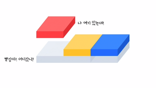
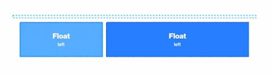
1.자식에 float(뜨다)를 사용하면 부모는 자식을 집나간 자식으로 생각한다. 즉 부모는 그 집나간 자식의 높이를 인식하지 못함
-
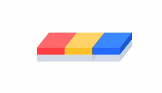
부모 안에 빨간 , 노랑 , 파랑 자식이 3명 있다. 각 높이가 200px , 따라서 부모의 높이는 600px (따로 부모의 hegiht를 선언하지 않을경우 자식요소의 hegiht의 합 = 부모의 height)
-
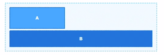
그중 빨간자식한테 float를 주게 되면
-
나머지 노랑 파랑 자식의 위치는 다음과 같아지며, 따로 부모의 hegiht를 선언하지 않을경우 , 자식요소의 hegiht의 합 = 부모의 height 에 의해서 다음과 같이 보여진다. 따라서 부모의 높이는 400px

-
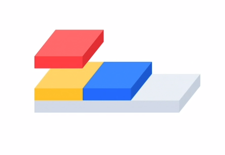
따라서 우리한테 보이는 화면의 모습은 다음과 같다.
-
-
2.블록으로 바뀌지만 하자가 있는 블록으로 바뀐다.(직접해봐야지 이해가 잘됨)
-
inline , inline block, block —> block 이 되지만 다음과 같은 요소가 반영 안됨
-
박스에 width를 선언하지 않을 경우 , width = 부모의 content-box의 100% 이지만 float가 선언된 박스는 자기 자신의 콘텐츠 크기만큼 width를 가지게 된다.
-
따로 width를 선언한 경우, 남은 공간은 margin으로 자동으로 채움이지만 float가 선언된 박스는 자동으로 주었던 margin이 사라짐
-
부모에게 hegiht를 주지 않고 자식요소 모두에 float를 줄경우 부모의 hegiht는 0px 이 되는것을 볼수 있다. 왜냐하면 모두 집나간 자식들이기 때문에 부모는 자신한테 자식이 없다고 생각하므로.. (따로 부모의 hegiht를 선언하지 않을경우 , 자식요소의 hegiht의 합 = 부모의 height)
-
-
-
-
3.블럭 요소들은 float 존재를 인식 못하지만 텍스트나 이미지 같은 inline의 성격을 가지고 있는 애들은 float의 존재를 인식한다. 지금의 경우는 부모의 hegiht가 0 이 되었으므로 형제 div가 아래에 배치된것이다.
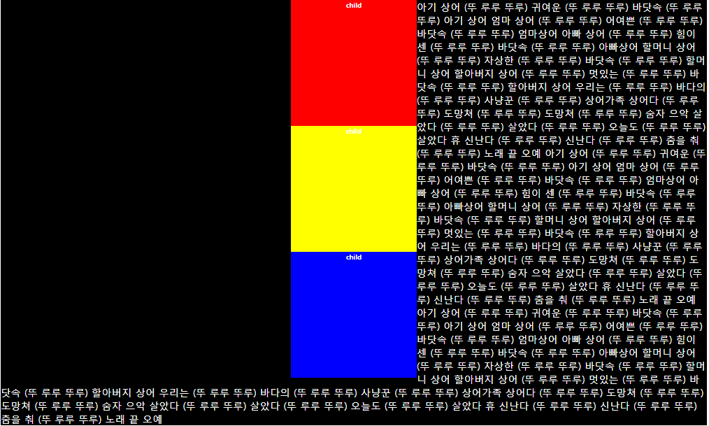
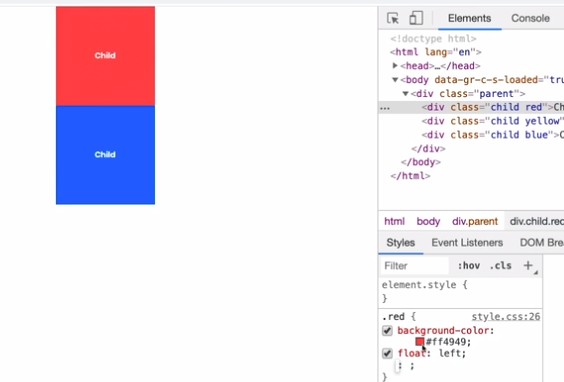
<!DOCTYPE html>
<html lang="en">
  <head>
    <meta charset="UTF-8" />
    <meta name="viewport" content="width=device-width, initial-scale=1.0" />
    <link rel="stylesheet" href="styles.css" />
    <title>Document</title>
  </head>
  <body>
    <div class="parent">
      <div class="child red">child</div>
      <div class="child yellow">child</div>
      <div class="child blue">child</div>
    </div>

    <div class="other">
      아기 상어 (뚜 루루 뚜루) 귀여운 (뚜 루루 뚜루) 바닷속 (뚜 루루 뚜루)
      아기 상어 엄마 상어 (뚜 루루 뚜루) 어여쁜 (뚜 루루 뚜루) 바닷속 (뚜 루루
      뚜루) 엄마상어 아빠 상어 (뚜 루루 뚜루) 힘이 센 (뚜 루루 뚜루) 바닷속
      (뚜 루루 뚜루) 아빠상어 할머니 상어 (뚜 루루 뚜루) 자상한 (뚜 루루 뚜루)
      바닷속 (뚜 루루 뚜루) 할머니 상어 할아버지 상어 (뚜 루루 뚜루) 멋있는
      (뚜 루루 뚜루) 바닷속 (뚜 루루 뚜루) 할아버지 상어 우리는 (뚜 루루 뚜루)
      바다의 (뚜 루루 뚜루) 사냥꾼 (뚜 루루 뚜루) 상어가족 상어다 (뚜 루루
      뚜루) 도망쳐 (뚜 루루 뚜루) 도망쳐 (뚜 루루 뚜루) 숨자 으악 살았다 (뚜
      루루 뚜루) 살았다 (뚜 루루 뚜루) 오늘도 (뚜 루루 뚜루) 살았다 휴 신난다
      (뚜 루루 뚜루) 신난다 (뚜 루루 뚜루) 춤을 춰 (뚜 루루 뚜루) 노래 끝 오예
    </div>
  </body>
</html>
블록요소(div)는 빨간 노랑 파랑 박스가 float된것을 인식하지 못해 float 뒤에서 검은 배경을 깔았지만 텍스트나 이미지 같은 inline의 성격을 가지고 있는 애들은 float의 존재를 인식하여 float된 박스에 영향을 받는것을 볼수있다.
2. float(2)
-
float로 인해서 변하는 레이아웃들을 어떻게 잡을지에 대해서 알아보자
- 1.overflow:hidden 을 사용한다.(별로 권장하지 않는방법)
- 원래는 부모에게 hegiht를 주지 않고 자식요소 모두에 float를 줄경우 부모의 hegiht는 0px 이 된다고 했는, 부모에게 overflow : hidden을 하게 되면 집나간 자식들을 부모가 찾는다.
-
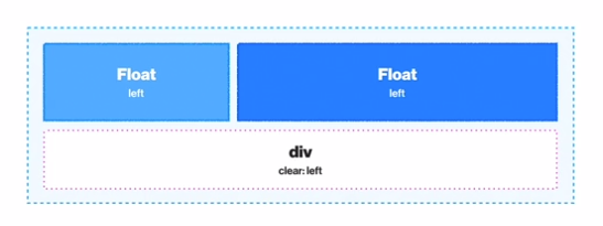
2.clear 을 사용한다.
-
집나간 자식요소를 다른 자식이 인식하게 된다.
-
clear : left right both - left : parent야 앞에 “float : left” 된 형제를 찾았어!
- right : parent야 앞에 “float : right” 된 형제를 찾았어!
- both : parent야 앞에 “float : left and right” 된 형제를 찾았어!
-
* {
  box-sizing: border-box;
}
parent {
  width: 200px;
  margin: 0 auto;
  background-color: gray;
}
.child {
  width: 200px;
  height: 200px;
  font-size: 5px;
  font-weight: bold;
  text-align: center;
  color: white;
}
.red {
  background-color: red;
}
.blue {
  background-color: blue;
}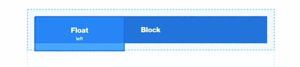
* {
  box-sizing: border-box;
}
parent {
  width: 200px;
  margin: 0 auto;
  background-color: gray;
}
.child {
  width: 200px;
  height: 200px;
  font-size: 5px;
  font-weight: bold;
  text-align: center;
  color: white;
}
.red {
  background-color: red;
  float: left;
}
.blue {
  background-color: blue;
}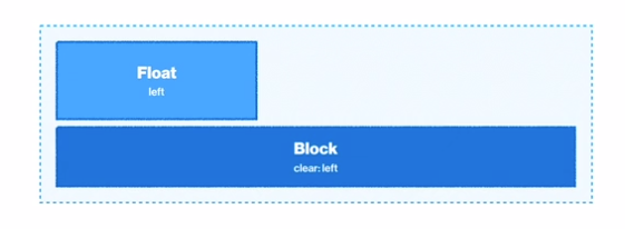
* { box-sizing: border-box; } parent { width: 200px; margin: 0 auto; background-color: gray; } .child { width: 200px; height: 200px; font-size: 5px; font-weight: bold; text-align: center; color: white; } .red { background-color: red; float: left; } .blue { background-color: blue; clear: left; } - 1.overflow:hidden 을 사용한다.(별로 권장하지 않는방법)
꿀 Tip
- style적인 상황 때문에 HTML을 건드는 방법은 굉장히 좋지 못한 방식이다. (즉 화면의 위치 때문에 HTML을 건드는 방법은 좋지 못하는 방법)
화면의 위치 때문에 아무런 의미도 없는 HTML의 div테그를 사용하였다….
굉장히 좋지 못한 방법
-
HTML을 건들지 않고 순전히 CSS로만 이 문제를 해결할수 있는 방법이 있다.
-
Presudo Element : html에 존재하지 않은 가상요소
-
그리고 그 가상 요소에다가 clear 를 주면 해결 !!
- 그 가상요소에다가는 반드시 content 속성을 적어야 한다.(공백이여도)
- 그 가상요소에다가는 반드시 display : block 속성을 적어야한다.
* { box-sizing: border-box; } .parent { width: 400px; margin: 0 auto; background-color: gray; } .child { width: 200px; height: 200px; font-size: 5px; font-weight: bold; text-align: center; color: white; } .red { background-color: red; float: left; } .blue { background-color: blue; float: left; } .yellow { background-color: yellow; float: left; } .other { background-color: black; color: white; } .parent::after { content: ""; display: block; clear: left; } -
3. float 훈련(1)
 ;
;
- Yosup’s Code
<!DOCTYPE html>
<html lang="en">
<head>
<meta charset="UTF-8" />
<meta name="viewport" content="width=device-width, initial-scale=1.0" />
<title>Float 1</title>
<link
href="https://fonts.googleapis.com/css?family=Roboto:400,500&display=swap"
rel="stylesheet"
/>
<link rel="stylesheet" href="./styles.css" />
</head>
<body>
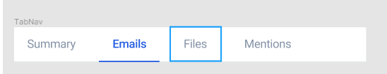
<nav class="TabNav">
<title>TabNav</title>
<div class="TabDiv">
<ul>
<li class="Summary">
<a href="#">Summary</a>
</li>
<li class="Emails">
<a href="#">Emails</a>
</li>
<li class="Files">
<a href="#">Files</a>
</li>
<li class="Mentions">
<a href="#">Mentions</a>
</li>
</ul>
</div>
</nav>
</body>
</html>
* {
  box-sizing: border-box;
  margin: 0;
}

body {
  font-family: "Roboto", sans-serif;
  letter-spacing: -0.02em;
  background: #e5e5e5;
}

.TabNav {
  position: relative;
  width: 540px;
  height: 54px;
  background: #ffffff;
}
.TabDiv {
  position: absolute;
  width: 446px;
  height: 52px;
  left: 0px;
  top: 0px;
  background: #ffffff;
}
.Summary {
  position: absolute;
  width: 115px;
  height: 52px;
  left: 0px;
  top: 0px;
}
.Emails {
  position: absolute;
  width: 93px;
  height: 52px;
  left: 131px;
  top: 0px;
  border-bottom: 1px solid #0174df;
}

.Emails a {
  color: #0174df;
}

.Files {
  position: absolute;
  width: 77px;
  height: 52px;
  left: 240px;
  top: 0px;
}
.Mentions {
  position: absolute;
  width: 113px;
  height: 52px;
  left: 333px;
  top: 0px;
}

li {
  float: left;
  text-align: center;
  line-height: 50px;
  list-style-type: none;
}

a {
  font-size: 18px;
  line-height: 20px;
  color: #8492a6;
  text-decoration: none;
}
- Kimbug’s Code
<!DOCTYPE html>
<html lang="en">
  <head>
    <meta charset="UTF-8" />
    <meta name="viewport" content="width=device-width, initial-scale=1.0" />
    <title>Float 1</title>
    <link
      href="https://fonts.googleapis.com/css?family=Roboto:400,500&display=swap"
      rel="stylesheet"
    />
    <link rel="stylesheet" href="./style.css" />
  </head>
  <body>
    <ul class="tab-menu">
      <li class="tab-menu-item">
        <a href="#">Summary</a>
      </li>
      <li class="tab-menu-item active">
        <a href="#">Emails</a>
      </li>
      <li class="tab-menu-item">
        <a href="#">Files</a>
      </li>
      <li class="tab-menu-item">
        <a href="#">Mentions</a>
      </li>
    </ul>
  </body>
</html>
* {
  box-sizing: border-box;
  margin: 0;
}

body {
  font-family: "Roboto", sans-serif;
  letter-spacing: -0.02em;
}

a {
  font-size: 18px;
  line-height: 20px;
  color: #8492a6;
  text-decoration: none;
}

/* ▼ WHERE YOUR CODE BEGINS */

.tab-menu {
  padding-left: 0;
  border-bottom: 1px solid #e5eaef;
  list-style-type: none;
}

.tab-menu::after {
  content: "";
  display: block;
  clear: both;
}

.tab-menu-item {
  float: left;
  margin-right: 16px;
}

.tab-menu-item.active {
  border-bottom: 2px solid #2860e1;
}

.tab-menu-item.active a {
  font-weight: 500;
  color: #2860e1;
}

.tab-menu-item:last-child {
  margin-right: 0;
}

.tab-menu-item a {
  display: block;
  padding: 16px 20px;
}
꿀팁 ~!!
- 이 문제에서 list에 padding을 주던 , a 에 padding을 주던 diplay 화면상에는 차이가 없지만 list에 padding을 줄경우 이름 주변을 클릭해도 이동이 안되기에, 편의상 a에 padding을 줬다.
질문과 답
- 질문
- 1.display: inline; 을 사용하면 , 가로형식으로 배치될수 있지 않을까?
- 2.그러면 inline-block을 사용하면 되지 않을까?
- 답
- 1.예시의 경우 각 list 마다 padding과 공간을 주어야 하기 때문에, inline 요소는 탈락 (inline 요소는 margin,padding,boder 의 top,bottom을 줄수 없고 , width와 hegiht를 주지 못하므로)
- 2.응 가능해~
4. float 훈련(2)
 ;
;
- Yosup’s Code
<!DOCTYPE html>
<html lang="ko">
  <head>
    <meta charset="UTF-8" />
    <meta name="viewport" content="width=device-width, initial-scale=1.0" />
    <title>Float 2</title>
    <link
      href="https://fonts.googleapis.com/css?family=Noto+Sans+KR&display=swap"
      rel="stylesheet"
    />
    <link rel="stylesheet" href="./styles.css" />
  </head>
  <body>
    <div class="card">
      <img
        src="/assets/images/css_img/user.jpg"
        alt="Customer support"
        class="card-user"
      />
      <div class="card-content">
        <h1 class="card-title">RE: 안녕하세요 배송 관련 문의드립니다</h1>
        <strong class="card-role"> customer support </strong>
        <p class="card-answer">
          안녕하세요 우현님. 문의 드린 사항에 대한 답변드립니다. 지난 12...
        </p>
      </div>
    </div>
  </body>
</html>
* {
  box-sizing: border-box;
  margin: 0;
}

body {
  font-family: "Noto Sans KR", sans-serif;
  letter-spacing: -0.02em;
  background: #e5e5e5;
}

h1 {
  font-size: 16px;
  font-weight: 400;
  color: #1f2d3d;
  line-height: 1.25;
}

strong {
  font-size: 14px;
  font-weight: 400;
  color: #afb3b9;
  line-height: 1.4285714286;
}

p {
  font-size: 16px;
  color: #79818b;
  line-height: 1.5;
}

.card {
  max-width: 540px;
  min-width: 500px;
  height: 120px;
  background-color: #ffffff;
  margin: 0 auto;
}

.card-content {
  padding: 20px 20px;
}
.card-user {
  float: left;
  border-radius: 50%;
  width: 44px;
  height: 44px;
  margin: 20px 20px 56px 20px;
}

.card::after {
  content: "";
  display: block;
  clear: both;
}
.card-title {
  font-size: 16px;
  margin-bottom: 4px;
} /* ▼ WHERE YOUR CODE BEGINS */

.card-role {
  margin-bottom: 12px;
}
- Kimbug’s code
<!DOCTYPE html>
<html lang="ko">
  <head>
    <meta charset="UTF-8" />
    <meta name="viewport" content="width=device-width, initial-scale=1.0" />
    <title>Float 2</title>
    <link
      href="https://fonts.googleapis.com/css?family=Noto+Sans+KR&display=swap"
      rel="stylesheet"
    />
    <link rel="stylesheet" href="./style.css" />
  </head>
  <body>
    <div class="card">
      <img src="./assets/user.jpg" alt="Customer support" class="card-user" />
      <div class="card-content">
        <h1>RE: 안녕하세요 배송 관련 문의드립니다</h1>
        <strong> customer support </strong>
        <p>안녕하세요 우현님. 문의 드린 사항에 대한 답변드립니다. 지난 12...</p>
      </div>
    </div>
  </body>
</html>
* {
  box-sizing: border-box;
  margin: 0;
}

body {
  font-family: "Noto Sans KR", sans-serif;
  letter-spacing: -0.02em;
}

h1 {
  font-size: 16px;
  font-weight: 400;
  color: #1f2d3d;
  line-height: 1.25;
}

strong {
  font-size: 14px;
  font-weight: 400;
  color: #afb3b9;
  line-height: 1.4285714286;
}

p {
  font-size: 16px;
  color: #79818b;
  line-height: 1.5;
}

/* ▼ WHERE YOUR CODE BEGINS */

.card {
  padding: 20px;
  background-color: #fff;
}

.card::after {
  content: "";
  display: block;
  clear: left;
}

.card-user {
  float: left;
  width: 44px;
  height: 44px;
  border-radius: 50%;
  margin-right: 20px;
}

.card-content {
  float: left;
}

.card-content h1 {
  margin-bottom: 4px;
}

.card-content strong {
  display: block;
  margin-bottom: 12px;
}
꿀팁 ~!!
- 상대적인 위아래 간격 조절 할때 margin-top 또는 margin-bottom 중 일관적이게 하나만 쓰는게 좋다. 예를들어 A B C 가 있는데 A와 B의 간격이 3px 이고 B와 C와 간격이 3px이면 A에다가 margin-bottom 주고 B에다가 margin-bottom을 주는게 좋지 A에다가 margin-bottom을 주고 C에다가 margin-top을 주는건 별루
질문과 답
-
질문
- 1.나는 float를 사진에다가만 줫다. 어차피 text는 float된것을 인지하기에 겹쳐지지 않고 옆에 나타나니까.. 이렇게 작성해도 상관없을까?
-
답
- 1.놉 !! 이럴경우 사진만 float되고 나머지는 떠있는 이미지 그 뒤로 가기 때문에 물론 사진과 같은 결과를 얻을수 있겠지만. 배경색을 입혀보면, 사진과 text가 나눠지지 않았다는것을 볼수있다.
Leave a comment