
4.Position
1. Position 1
- Position 이란?
- 요소를 원하는 위치에 자유롭게 이동 시키기 위해 사용 속성
-
Postion의 사용할때는 기준점을 파악하는것이 중요하다
-
Position 의 종류
-
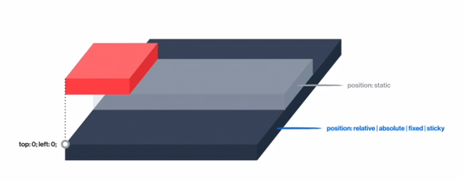
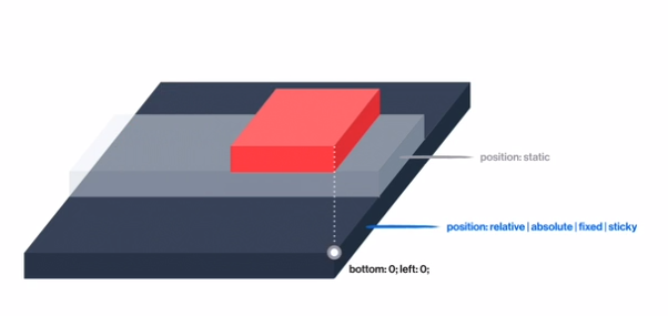
static : 모든 요소의 기본 positon 값 , 가장 일반적인 상태(default값)
-
relative : 이동의 기준점은 원래있던 자리, 그 기준으로 해서 위아래 좌우로 움직임
-
float vs relative
float는 붕 떠서 집 나간 자식이라 다른자식요소들이 인지를 못해 레이아웃의 위치가 바뀌거나 하지만 relative도 마찬가지로 붕 뜨지만 다른자식요소들이 인지를 하여 다른 요소들의 위치에 변화에 영향을 주지 않는다.
-
-
absolute
-
fixed
-
sticky(지원하는 브라우저가 많지 않음)
-
2. Position 2
-
1.Position 의 종류
-
static
-
relative
-
absolute :
-
1.absolute 를 사용하면 부모는 자식을 집나간 자식으로 생각한다. (float 와 공통점)
-
2.블록으로 바뀌지만 하자가 있는 블록으로 바뀐다. (float 와 공통점)
-
absolute가 선언된 박스는 자기 자신의 콘텐츠 크기만큼 width를 가지게 된다.
-
absolute가 선언된 박스는 자동으로 주었던 margin이 사라짐
-
float vs absolute (float와 차이점) lnline의 성격을 가지고 있는 애들은 float의 존재를 인식하지만 absolute의 존재를 인식하지 못한다.

-
-
3.absolute의 경우 자신을 감싸고 있는 여러 조상중에 자신이 기준을 삼고싶은 기준점을 정할수 있다. (단 그 기준점은 position : static 이 아닌요소를 기준점으로 잡는다. 예를들어 position : relative , fixed , absolute , sticky)
-
-
-
position fixed 는”position : abolute 를 사용했을때랑 완전히 동일한 구성이 일어나지만, 차이점은 기준점이 명확하게 정해져 있다. 그 기준점이 바로 “viewport(브라우저 창의 전체크기)”
-
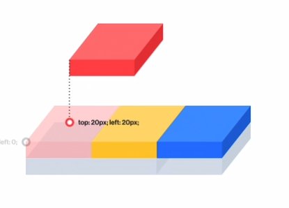
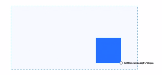
- 2.Position 을 잡았으면 원하는 위치에 놓기 위한 속성이 필요하다.
- top
- left
- right
- bottom
-
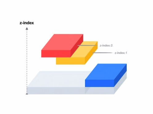
3.z-index : 포지션된 요소들의 수직방향으로서의 레벨
3. Position 3
-
sticky vs fixed
-
sticky는 원래있던 자리를 기준으로 잡으며(마지 relative처럼), 그 자리에 항상 고정되어있다. 그리고 top,left등을 꼭 써워쟈아한다.
-
fixed 역시 고정되어있지만 , viewport를 기준으로 잡는다.
-
꿀 Tip
-
position : absolute는 기준점이 필요하다. position이 relative, fixed , absolute , sticky 그러나 기준점을 만들어주기위해 position :absolute를 사용한다면 그 position의 기준점을 또 잡아줘야하는 현상이 발생한다.
- 예를들어 자식요소가 position : absolute이다. 그런데 그 기준점을 잡아주기 위해 부모한테 position : absolute를 주게 되면 또 그 부모의 기준점을 잡아줘야하는 현상이 발생…
-
top , left , right , bottom 을 사용할때는 위치를 잡기 위해 다 사용할 필요없이 , 2가지만 사용하여도 충분히 위치를 지정해줄수 있고 더 가까운곳에 속성을 사용하는것이 좋다.

3. Position 실습 (1)
- yosup’s coding
* {
box-sizing: border-box;
margin: 0;
}
body {
font-family: "Lato", sans-serif;
background-color: #e5e5e5;
}
h1 {
font-size: 16px;
font-weight: 400;
line-height: 1.5;
color: #273444;
}
/* ▼ WHERE YOUR CODE BEGINS */
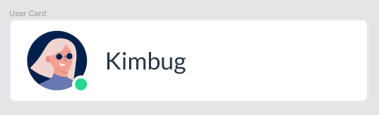
.user-card {
background-color: white;
}
.user-card::after {
content: "";
display: block;
clear: both;
}
.user-photo img {
display: block;
width: 40px;
height: 40px;
border-radius: 50%;
margin: 8px 12px;
}
.user-photo {
position: relative;
float: left;
}
.user-photo::after {
content: "";
display: block;
clear: both;
}
.user-name {
padding: 15px;
}
.user-status {
position: absolute;
right: 10px;
bottom: 10px;
width: 12px;
height: 12px;
border-radius: 50%;
background-color: #21d891;
border: 2px solid #ffffff;
}
- Kimbug coding
* {
  box-sizing: border-box;
  margin: 0;
}

body {
  font-family: "Lato", sans-serif;
}

h1 {
  font-size: 16px;
  font-weight: 400;
  line-height: 1.5;
  color: #273444;
}

/* ▼ WHERE YOUR CODE BEGINS */

.user-card {
  max-width: 240px;
  padding: 8px 12px;
  border: 1px solid #e5eaef;
  border-radius: 4px;
}

.user-card::after {
  content: "";
  display: block;
  clear: left;
}

.user-photo {
  float: left;
  position: relative;
  width: 40px;
  height: 40px;
  margin-right: 12px;
}

.user-photo img {
  width: 100%;
  height: auto;
  border-radius: 50%;
}

.user-photo .user-status {
  position: absolute;
  width: 10px;
  height: 10px;
  border: 2px solid #fff;
  border-radius: 50%;
  background-color: #21d891;
}

.user-name {
  float: left;
  padding: 8px 0;
}
꿀 팁
-
img테그는 inline 요소인데 width와 height 가 적용이 된다, 하지만 햇갈릴수 있으니 명시적으로 img테그를 display: block 처리해주기도 한다.
-
display : absolute 를 하면 block이 자동으로 되기 때문에 명시적으로 diplay: block을 해도 되지만 안해도 된다.
질문과 답
-
질문
-
1.position relative를 사용할시 부모를 영역을 벗어나 이동할수도 있던데, 이렇게 부모의 영역을 벗어나 사용해도 괜찮을지..?
-
- .user-status에서 position : relative를 하니까 이상해지던데 그 이유는??
-
-
답
-
- 자기의 원래 영역에서 벗어나고 싶을경우 absolute , 원래 영역안에서 조금씩만 이동하고 싶다 relative , viewport를 기준으로 사용하고 싶다 fixed
-
- relative를 사용하면 초록점이 inline 테그이므로 블록인 img 옆에 자기만하게 보이는것이다. 그래서 position : absolute를 사용하여 block으로 만들어서 사용해야한다.
-
4. Position 실습 (2)
- yosup’s coding
* {
box-sizing: border-box;
margin: 0;
}
body {
font-family: "Noto Sans KR", sans-serif;
letter-spacing: -0.02em;
background-color: #999;
}
h1 {
font-size: 22px;
font-weight: 500;
color: #1f2d3d;
line-height: 1.4545454545;
}
span {
font-size: 14px;
font-weight: 400;
color: #7d858f;
line-height: 1.5;
}
strong {
font-size: 22px;
color: #2860e1;
line-height: 1.0909090909;
}
strong span {
font-size: 16px;
font-weight: 400;
color: #525d69;
line-height: 1.5;
}
button {
display: block;
width: 28px;
height: 28px;
border: none;
background-size: contain;
background-repeat: no-repeat;
background-position: center center;
background-color: transparent;
}
/* ▼ WHERE YOUR CODE BEGINS */
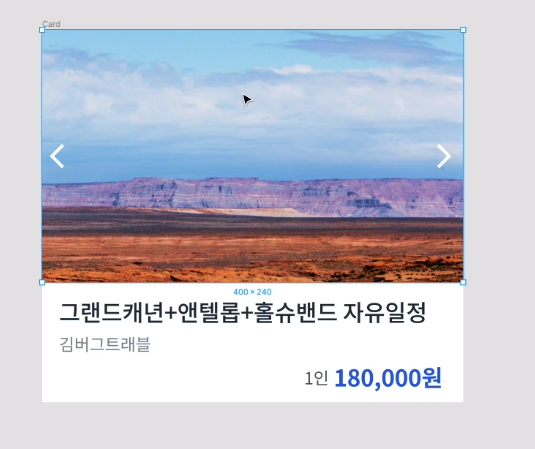
.card {
position: relative;
width: 400px;
height: 350px;
background-color: white;
}
.card-carousel img {
max-width: 100%;
}
.card-carousel button:nth-child(even),
.card-carousel button:nth-child(odd) {
position: absolute;
top: 100px;
}
.card-carousel button:nth-child(even) {
left: 0px;
}
.card-carousel button:nth-child(odd) {
right: 0px;
}
.card-content strong {
position: relative;
top: 40px;
left: 190px;
}
- Kimbug coding
* {
  box-sizing: border-box;
  margin: 0;
}

body {
  font-family: "Noto Sans KR", sans-serif;
  letter-spacing: -0.02em;
}

h1 {
  font-size: 22px;
  font-weight: 500;
  color: #1f2d3d;
  line-height: 1.4545454545;
}

span {
  font-size: 14px;
  font-weight: 400;
  color: #7d858f;
  line-height: 1.5;
}

strong {
  font-size: 22px;
  color: #2860e1;
  line-height: 1.0909090909;
}

strong span {
  font-size: 16px;
  font-weight: 400;
  color: #525d69;
  line-height: 1.5;
}

button {
  display: block;
  width: 28px;
  height: 28px;
  border: none;
  background-size: contain;
  background-repeat: no-repeat;
  background-position: center center;
  background-color: transparent;
}

/* ▼ WHERE YOUR CODE BEGINS */

.card {
  width: 400px;
}

.card-carousel {
  position: relative;
  background-color: black;
}

.card-carousel img {
  display: block;
  width: 100%;
  height: auto;
}

#prev,
#next {
  position: absolute;
  top: 50%;
  /*기준점으로 잡은 즉 relative로 잡은 것을 기준으로 한다.
  그리고 50%부터 이미지를배치하기 때문에 화면상으로 볼때 반에 위치하는것 처럼 보이지 않는다.*/

  transform: translateY(-50%);
  /* 이미지 배치의 문제를 고치기 위해 사용하는 transform : translate(X,Y) , X축과 Y축으로 얼마만큼 이동하느냐*/
  /* transform은 자기자신을 기준으로 하고 있다. 따라서 translateY(-50%)를 하면 자기자신(#prev,#next)의 높이(Y축)의 -50%를 만큼 이동하게 된다 -50%이므로 위로 자기자신의 높이의 반을 올라가게된다.  */
}

#prev {
  left: 0;
}
#prev {
  right: 0;
}

.card-content {
  padding: 12px 12px;
}

.card-content h1 {
  margin-bottom: 2px;
}

/* margin-bottom으로 해결이 되는 형태라면 margin-bottom만 이용해서 해결하는것이 좋지
margin-bottom , margin-top 을 다양하게 이용하는것은 좋지 못하다. */

.card-content strong {
  display: block;
  margin-top: 8px;
  text-align: right;
}

/* position을 사용할때 아무때나 사용하는것이 아니라, 상황에 맞는 position을 하는게 중요하다. */
꿀팁!
-
1.position에서 top, left, right, left의 %의 기준은? 기준점으로 잡은 즉 relative로 잡은 것을 기준으로 한다.
-
2.positon의 top 50%는 정말 위-아래 가운데를 말하나?
-
위치상 위-아래의 50% 말하기는 하나, 화면상 50%처럼 보이지는 않는다. 그 이유는 50% 부터 배치하기 때문이다.
-
해결방법 : transform 의 translate를 사용한다
#prev, #next { position: absolute; top: 50%; transform: translateY(-50%); } -
-
3.transform 의 translate 의미는 무엇일까?
-
transform : translate(50px,50px) ===> X,Y축으로 50px 이동한다.
-
transform : translateX(50px) ===> X축으로 50px 이동한다.
-
transform : translateY(50px) ===> Y축으로 50px 이동한다.
-
transform : translate(50%,50%) ===> X축으로 자기자신(선언한테그)의 너비의 50%만큼 이동 , Y축으로 자기자신의 높이의 50% 만큼 이동
-
transform : translateX(50%) ===> X축으로 자기자신(선언한테그)의 너비의 50%만큼 이동
-
transform : translateY(50%) ===> Y축으로 자기자신(선언한테그)의 높이의 50% 만큼 이동
-
-
4.Position은 아무때나 사용하는것이 아니라 그 역할에 맞게 사용해야한다. 굳이 Position을 사용할 필요가 없음에도 사용하는건 금물
-
5.margin-bottom으로 해결이 되는 형태라면 margin-bottom만 이용해서 해결하는것이 좋지 margin-bottom , margin-top 을 다양하게 이용하는것은 좋지 못하다
-
6.이미지는 display : inline이 default 값이지만, width와 height 가 조절 되는 특이한 친구이다. 따라서 명시적으로 inline:block으로 선언해준다.
5. Position 실습 (3)
-
yosup’s coding
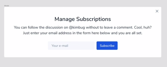
* { box-sizing: border-box; margin: 0; } body { width: 100%; height: 100vh; font-family: "Nunito Sans", sans-serif; color: #273444; background-color: #000; } input:focus, input:active, button:focus, button:active { box-shadow: none; outline: none; } .modal { background-color: #fff; } .modal-title { font-size: 24px; font-weight: 600; line-height: 1.6666666667; } .modal-desc { font-size: 16px; line-height: 1.5; } .input-group input, .input-group button { font-size: 14px; font-family: "Nunito Sans", sans-serif; line-height: 1.4285714286; } .close-button { width: 20px; height: 20px; border: none; background-color: transparent; background-position: center center; background-size: contain; background-repeat: no-repeat; } /* ▼ WHERE YOUR CODE BEGINS */ .modal { position: relative; width: 671px; height: 216px; } .modal .modal-title { text-align: center; padding-top: 32px; } .modal .modal-desc { padding: 4px 40px 32px 40px; } .modal .input-group { padding: 0px 186.5px; } .modal > button { position: absolute; top: 0; right: 0; }- kimbug’s coding
/* 윗부분 생략 */

/* ▼ WHERE YOUR CODE BEGINS */

.modal {
  position: fixed;
  /* position fixed를 선언하면 허점있는 block요소가 되는데
  따라서 그 텍스트 만큼 자리잡지만 padding이 있기때문에
  padding을 포함한 모습을 보이게 된다.
  또한 fixed의 기준점은 viewport 이기 떄문에 이걸 기준으로 위치를 지정햇다*/

  top: 50%;
  left: 50%;
  transform: translate(-50%, -50%);
  /* 그래서 top과 left 50%로 줬지만 화면상 이상하므로 transform을 해줘서 가운데정렬을 맞춰줬다. */

  padding: 32px 40px;
}

.modal-title,
.modal-desc {
  text-align: center;
}

.modal-title {
  margin-bottom: 4px;
}

.modal-desc {
  width: 590px;
  margin: 0 auto;
}

.input-group {
  text-align: center;
}

/* block 요소안에 inline요소의 정렬을 위해 사용되는 text-align

block 요소 안의 inline-block 또는 inline은 text-align이 먹힌다는 사실..!!
하지만 이것보다 더 좋은 방식이 있으니 이부분은 참고만 하자 */

.input-group input {
  width: 200px;
  height: 36px;
  padding: 0 16px;
  border-radius: 4px;
  border: none;
  margin-right: 8px;
  background-color: white;
}

/* 가운데 정렬을 하기위해 padding이나 margin을 사용하는 건 별로 좋지 않은 방법 같다. 너무 px의 값이 커질수도 있으니.. */

.input-group button {
  height: 36px;
  padding: 0 14px;
  border-radius: 4px;
  border: none;
  background-attachment: #2860e1;
}

.close-button {
  position: absolute;
  top: 8px;
  right: 8px;
  /* 우리가 position absolute를 했을때 다른곳의 기준점을 주기위해  .modal에 position :relative를 넣어야하지만, 여기서는 .modal에 이미 positon : fixed가 있기때문에 또 선언해줄필요가 잆다.  */
}
꿀팁!
-
1.가운데 정렬을 하기위해 padding이나 margin을 사용하는 건 별로 좋지 않은 방법 같다. 너무 px의 값이 커질수도 있으니..
-
2.그래서 좋은 방법이 margin: 0 auto; 이나 또는 text-align인데 text-align의 같은 경우 blcok요소 안에 inline요소들 즉 inline-block이나 inline 한테만 적용 된다는걸 참고하길 바란다.
-
3.앞서 말했듯이 text-align 을 이용해 block요소안에 inline요소들을 가운데 정렬시킬수 있다 했는데 더 좋은 방법이 있으니 2번 꿀팁은 그냥 참고만하자.
-
4.position의 사용과 가운데 정렬을 위한 transform: translate
.modal {
  position: fixed;
  /* position fixed를 선언하면 허점있는 block요소가 되는데
  따라서 그 텍스트 만큼 자리잡지만 padding이 있기때문에
  padding을 포함한 모습을 보이게 된다.
  또한 fixed의 기준점은 viewport 이기 떄문에 이걸 기준으로 위치를 지정햇다*/
  top: 50%;
  left: 50%;
  transform: translate(-50%, -50%);
  /* 그래서 top과 left 50%로 줬지만 화면상 이상하므로 transform을 해줘서 가운데정렬을 맞춰줬다. */
  padding: 32px 40px;
}
5.position : absolute; 의 기준점을 잡아주는 요소는 static을 제외한 모든 요소이다. position : fixed , absoulte , relative 하지만 absolute는 무한의 기준점을 잡아줄수 있기에 쓰지 않는다.
.modal {
  position: fixed;
  top: 50%;
  left: 50%;
  transform: translate(-50%, -50%);
  padding: 32px 40px;
}
.close-button {
  position: absolute;
  top: 8px;
  right: 8px;
}
Leave a comment