6.Media Query
1. Media Query
-
반응형 웹(Responsive Web) 이란? 사용자가 접속한 브라우저의 사이즈에 반응을 하는 웹
-
반드시 필요한 2가지
- Media Query(CSS에서 선언)
@media screen and (min-width: 760px) { } <!--해석: 내가 미디어 쿼리를 선언할꺼야(@media), screen에 관해서 얘기할건데 최소 사이즈가 768px 이다 즉 768px 이상에서는 다음과 같은 css를 주어라. 즉 미디어쿼리를 해줌으로써 사이즈마다 다른 css가 적용됨 min-width와 max-width 가 어렵게 늦겨지면 min-width는 이상이라고 생각하고 max-width는 이하라고 생각하자. -->;- viewport meta(HTML에서 선언)
<meta name="viewport" content="width=device-width" />
 <!-- 해석 : 나는 메타데이터를 줄건데 viewport에 관한걸 줄거고, 앞으로 웹사이트의 크기는 사용자가 사용하는 디바이스 크기에 맞춰줘  -->
-
꿀팁!
-
vh 단위 : vh(viewport height), vw보다 더 많이쓰는 단위
-
vw 단위 : vw(viewport weight)
-
예를들어 10vh면 = 내가보는 viewport(기기화면전체)에서 높이 10%를 차지함
2. Media Query 실습
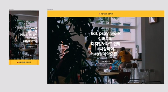
대박인 꿀팁!!!
-
반응형 웹을 작업할때는, 우선적으로 모바일부터 작업하는게 정설이다
-
IPhone 5/SE 에서 식별이 가능하다면 웬만한 모바일 기기에서 다 잘 보인다. 따라서 Iphone 5/SE 를 기준으로 화면을 구성하자
-
a태그를 버튼만큼 크게 늘리는 가장 효율적이 방법이 무엇일까?
- yosup’s coding
.banner { width: 100%; position: fixed; bottom: 0; left: 0; display: flex; justify-content: center; align-items: center; background-color: yellow; height: 64px; } .banner-title { font-size: 18px; } .banner-title a { display: block; width: 100%; font-size: 18px; }- kimbug’s coding
.banner { width: 100%; background-color: rgb(255, 255, 255); height: 64px; } .banner-title a { display: flex; justify-content: center; align-items: center; width: 100%; height: 64px; font-size: 18px; }- 결론 : a 테그에 flex를 주고 높이를 준다. 즉 a테그를 버튼의 크기만큼 차지하게 만든다.
-
배경색을 흐릿하게 하는 방법이 무엇이 있을까? opacitiy를 주니까 글씨든 배경색이든 흐릿해지던데?
- yosup’s coding
.landing-link { display: flex; flex-direction: row; justify-content: center; align-items: center; width: 160px; height: 52px; border: 2px solid white; border-radius: 16px; font-size: 15px; opacity: 0.5; }- kimbug’s coding
.landing-link { display: flex; flex-direction: row; justify-content: center; align-items: center; width: 160px; height: 52px; font-size: 15px; background-color: rgba(0, 0, 0, 0.5); border: 2px solid white; border-radius: 16px; }- 결론 : rgba를 이용하면 된다.
-
하단에 있던 배너를 상단으로 옮길시
- yosup’s coding : 포지션 자체를 없엠, 이리해버리니 fixed된 기능도 사라지게 되므로 좋지않은 방식
.banner { position: unset; }- kimbug’s coding : 우리가 position의 위치를 정할때 top 와 bottom 중에 한개 , left 와 right 중에 한개를 고르려고 했다. 따라서 bottom을 auto로 만들면 bottom의 기능이 사라지고 left 0 이 기존에 있었으므로 top 0을 사용하요 top 한개, left 한개를 사용하여 위치를 고르게 되었다.
.banner {
  top: 0;
  bottom: auto;
}
Leave a comment